Step 1: Enter Your Data
- Open a blank Excel workbook.
- In one column, enter your Years (e.g., 2015, 2016, 2017, 2018, 2019).
- In an adjacent column, enter your corresponding Sales data (e.g., 2900, 2800, 3000, 3200, 4000).
Step 2: Create a Basic Chart
- Highlight all of your data, including the “Years” and “Sales” headings.
- Go to the “Insert” tab on the top menu.
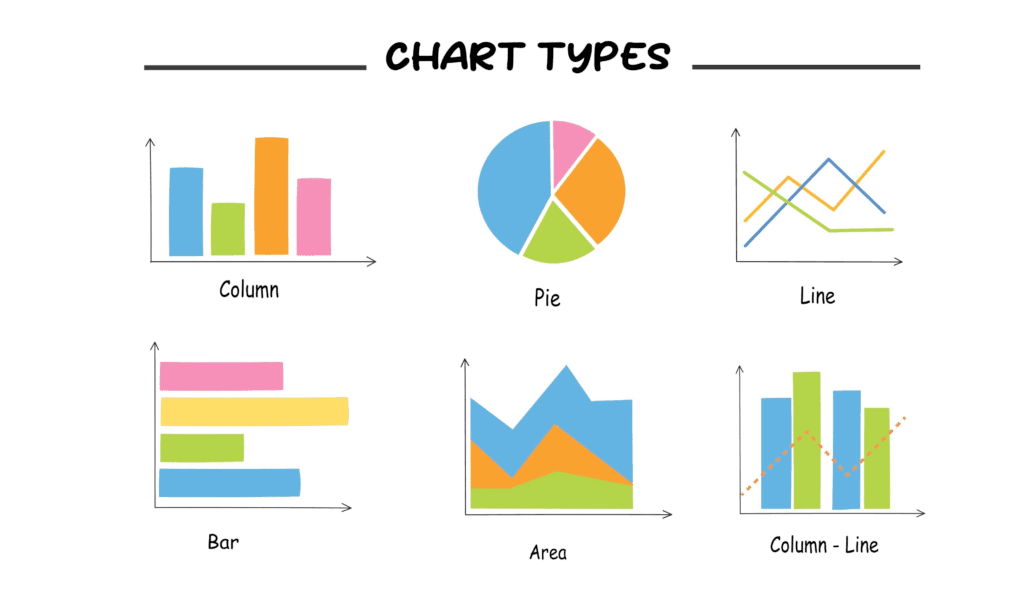
- In the “Charts” section, select a chart type. The example uses a “Line” chart.
- A basic chart will appear, but it may not be correctly formatted.
Step 3: Edit and Refine the Chart
- Right-click on the chart and select “Select Data…”.
- In the “Select Data Source” window, you’ll see a list of “Legend Entries” and “Horizontal (Category) Axis Labels.”
- Under “Legend Entries (Series),” you may see “Years” listed as a series. Delete it as it’s not a data series you want to plot. Make sure only “Sales” is listed as a series.
- Under “Horizontal (Category) Axis Labels,” click “Edit.”
- Highlight the cells containing your years (e.g., 2015-2019) and click “OK.” This will ensure your X-axis labels are correct.
- Click “OK” to close the window. Your chart should now correctly display the sales data with the proper years on the horizontal axis.
Step 4: Explore Different Chart Types
After your data is correctly displayed, you can change the chart type to best visualize your data.
- Right-click on the chart again.
- Select “Change Chart Type…”
- You can explore different options like Column charts, Pie charts, and various other styles to see which one best represents your data. The example text concludes that the basic line chart works best for this purpose.